The revamped Power Automate and Power Apps sites have been out quite a few months now. But after them properly embedding into our day to day development, there’s a few things to highlight.
Left Menu
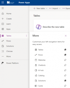
On the left hand side you will see all the usual options such as connections, solutions, etc however they are now moveable and pinnable. They are also contextual to the site you are using, be it Automate Apps or Pages (although Pages is more limited).
The Good
Pinning and moving is obviously by far the best feature here, to create a layout that suits your development workflow individually, as per these screenshots:
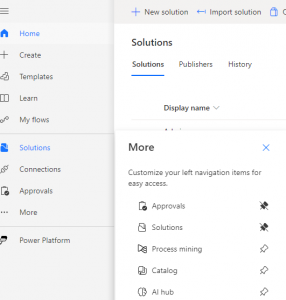
You will see many contextual options such as process mining on automate or choices on apps, as it saves too many options being available on a single tool. There are also filters for unmanaged and managed solutions.
There are also some very useful features such as editing tables, flows, etc within solutions in new tabs, however they only work within the relevant make site (flows within Power Apps don’t have new tabs for example)
The Bad
If there are contextual options, why does tables appear on automate and open apps? Or websites on apps that opens pages? Solution filtering is also not on automate yet. This is confusing matters tremendously for developers and it should either be a single site for the entire platform and group on the left, or properly segregate the options.
Summary…
This is a more succinct article, as this is the fundamental core of the new interfaces. My recommendation for now would be to use all 3 sites depending what you are editing – apps, flows, sites, etc. Do not cross them over as it will become a poor experience.
However, as always, keep as much as you can in solutions (this blog is primarily focussed on pro-developers at the moment, so this should be a given) and this will naturally happen anyway.
0 Comments